Rethinking Toronto's Brutalist Concrete Streetscape
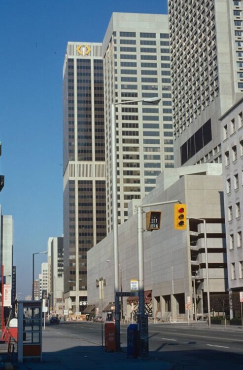
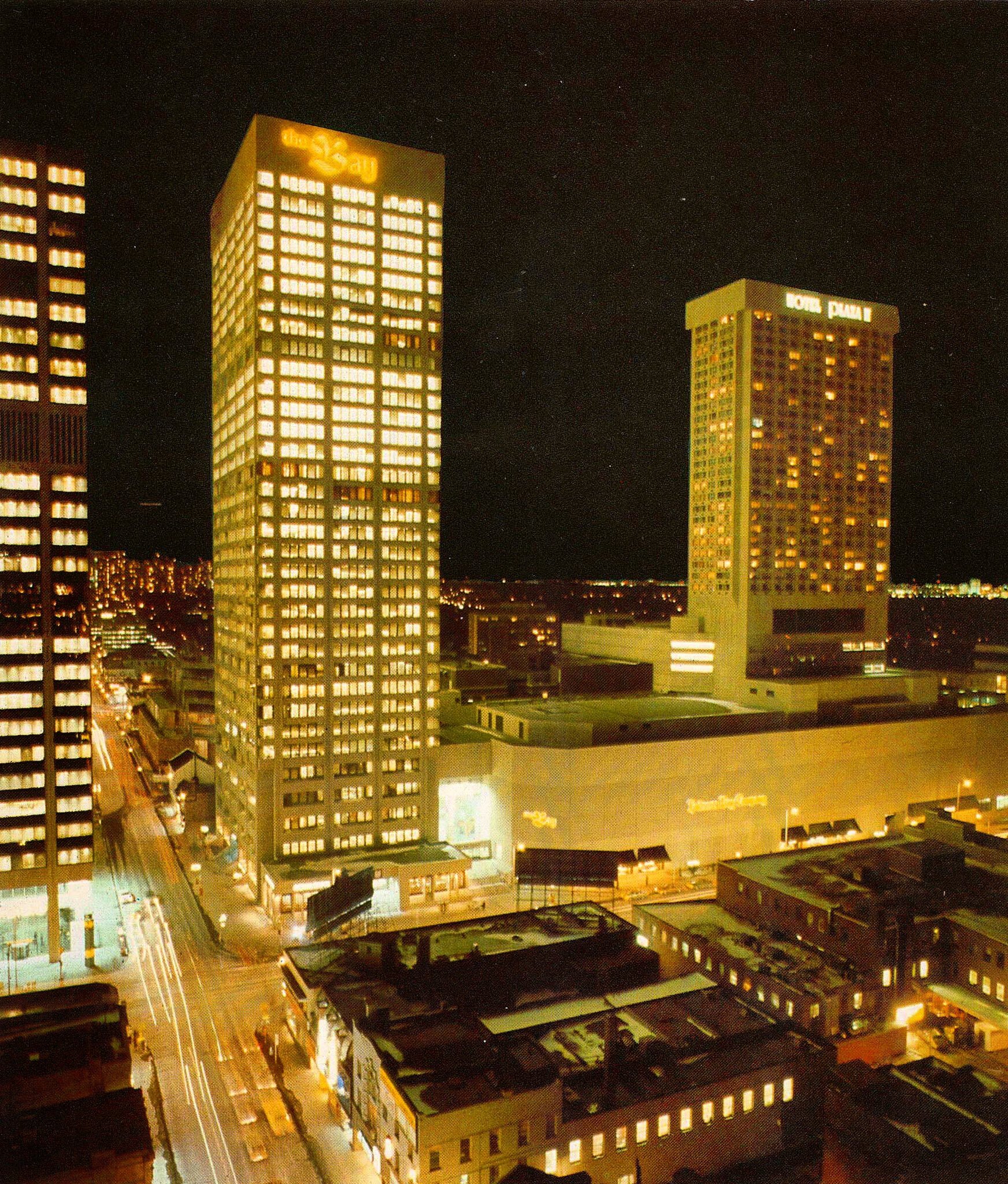
The Hudson’s Bay Centre at the intersection of Yonge & Bloor is one of Toronto’s many concrete fortresses. Unchanged for almost five decades, the brutalist complex is generally considered to be one of the ugliest in the city. The bunkeresque structure is composed of a 35-storey office tower, a Hudson's Bay department store, retail concourse, parking garage, underground path and is connected to the Bloor-Yonge subway station, the TTC's major east-west/north-south transfer point.
“This one puts the brutal in brutalism - the wall of concrete along Bloor is unforgivable. ”
Completed in 1974 and occupying an entire city block, the west tower served as the headquarters for the retail giant Hudson's Bay Company (HBC) while the east tower houses a 30 storey, 258 room Marriot hotel. With its imposing fortress-like facade, the lively centre interacts with the city in many ways yet offers minimal interaction with the surrounding streetscape.
It looks like that is about to change.
While cities in the 1970’s may have been designed around the automobile, cities today are looking for new ways to engage with their neighbours. With a Walk Score of 100 out of 100, this location is an urban paradise so daily errands do not require a car, tourists can wander out into the city and local residents can quickly pop in.
This is precisely why W-Hotel has announced a bold new addition to the complex and their entrance in Toronto’s booming tourism industry. Slated to open later this year, the brand will bring bold design, innovative programming and their signature ‘Whatever/Whenever’ experience to Toronto.
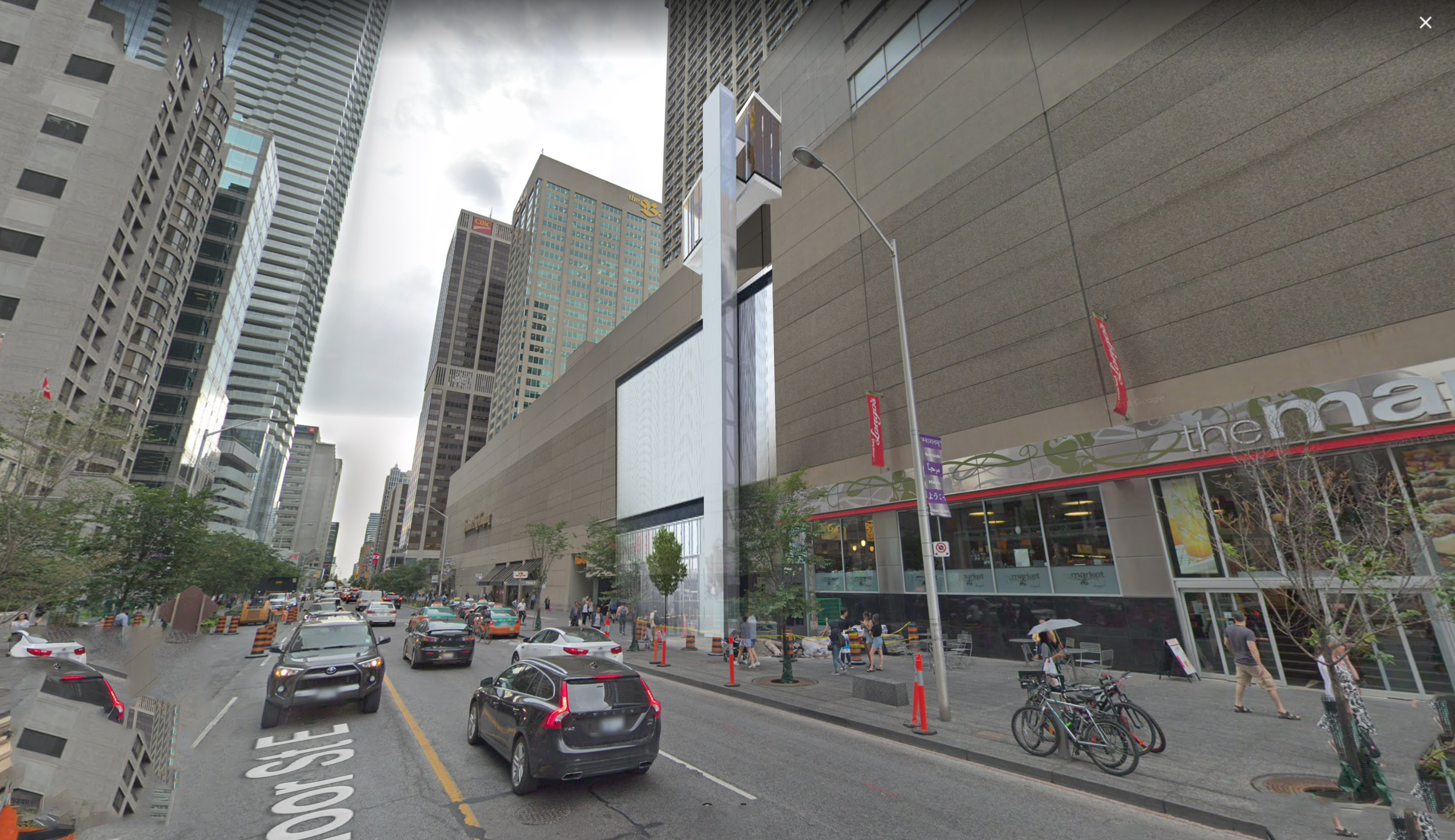
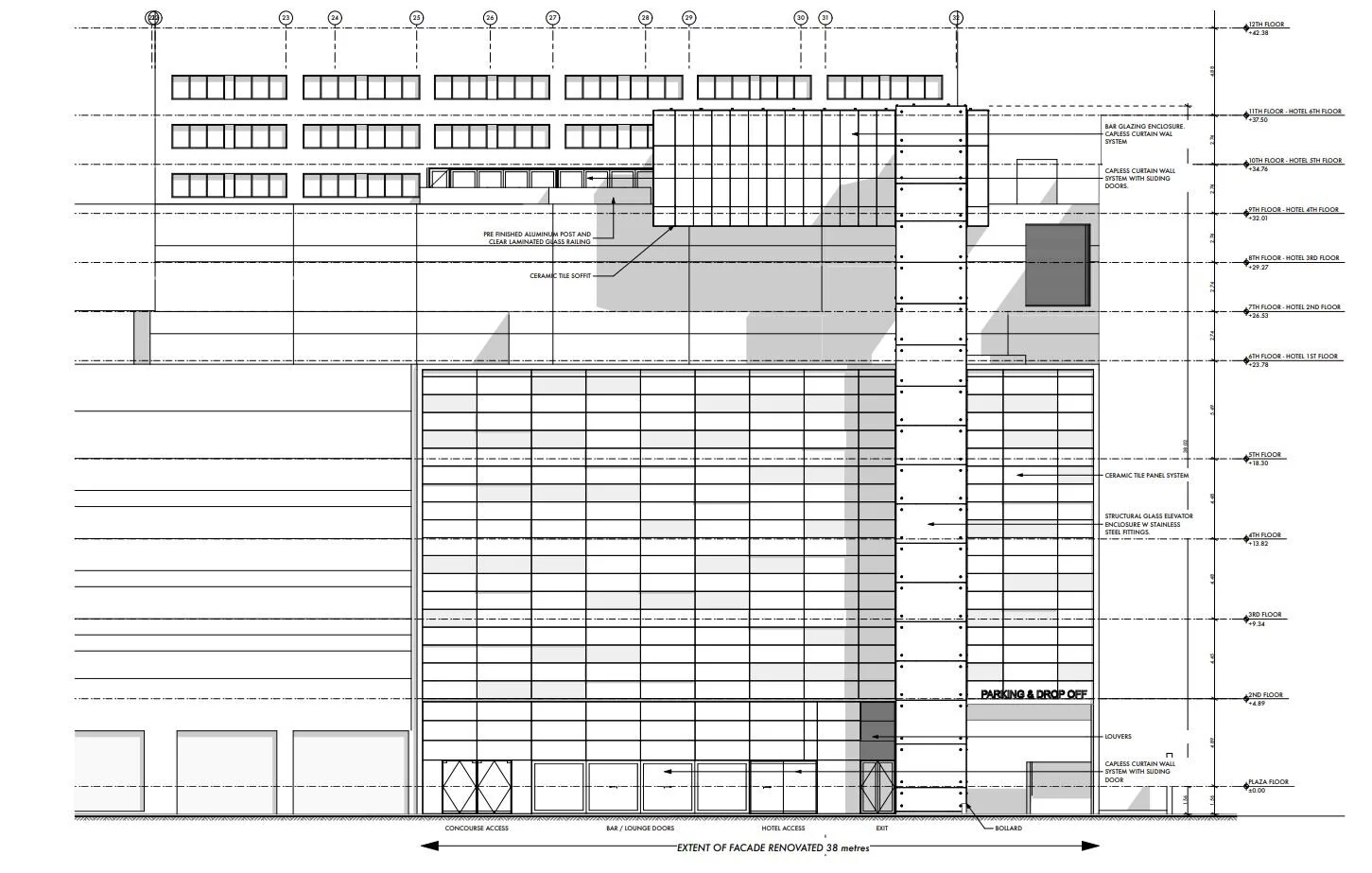
The 9-story, 255-room property will take advantage of the surrounding luxury boutiques, galleries and design studios as well as chic cafes, high-end bars and fine-dining restaurants. A glass-enclosed addition on the 9th and 10th floors (or the hotel's 4th and 5th floors) will be finished in glass curtainwall glazing contrasting the concrete container. The $60 million design transformation, which began in July 2019, reimagines the HBC centres brutalist facade with a truly interesting glass intervention.
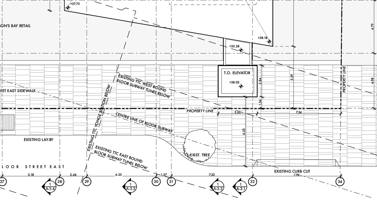
While the details aren’t entirely public, the upper and lower sections are to be connected via a structural glass elevator enclosure. Slicing out of the reinforced concrete wall, the addition creates 315 m² of new space, which combined with the existing area forms 497 m² of entertainment space. The hotel is expected to feature multiple food and beverage venues including a public lounge with a DJ booth/recording studio for collaborating, broadcasting and recording podcasts.
The proposed elevator appendage affords access to all these new spaces while breaking up the heavy monotony of the block. Translucent finishes allows the elevator's outline to be viewed in motion from the exterior adding a kinetic animation to the heavy facade.
Remodelling projects like this demonstrate an exciting evolution of our urban fabric and bring fresh eyes to a tired style of architecture. In the future we need to continue to think about how we can better occupy the many layers of our city. How policy changes like Toronto’s home grown ‘Green Roof Initiative’ to cultural activities like rooftop parties take procession of undersized space.
Over the past few years, a new appreciation for Brutalism has emerged and developers are reimagining how to reprogram these difficult to destroy monoliths. With high property costs and heritage conservation efforts, we expect to see level transition additions like this to become more common as property owners begin to develop their property portfolios into the vertical landscape.

