The Price Tower by Frank Lloyd Wright
The Price Tower, designed by the renowned American architect Frank Lloyd Wright, is a true masterpiece of modern architecture. Completed in 1956, it is one of only two vertically oriented structures designed by Wright, the other being the S.C. Johnson Wax Research Tower in Racine, Wisconsin.
The Price Tower is considered a unique and rare design in Wright's portfolio, as he is mostly known for his preference of low-lying, horizontal buildings that harmonize with their natural surroundings. This skyscraper stands out as an innovative and unique example of how Wright incorporated his organic architectural style into a vertical structure.
The Price Tower was commissioned by Harold Price, the president of the HC Price Company, a Bartlesville-based oil pipeline and chemical firm, as the corporate headquarters for his company. The building was designed to serve a dual purpose, with the primary tenant, the HC Price Company, occupying the top two floors of the tower, while the remaining offices and apartments would provide a source of revenue for the company.
The program for the building was carefully considered and designed to meet the specific needs of the HC Price Company, with the top two floors of the tower containing the company's offices and executive suites. The remaining floors of the building were designed as luxury apartments, which would be leased to generate additional income for the company.
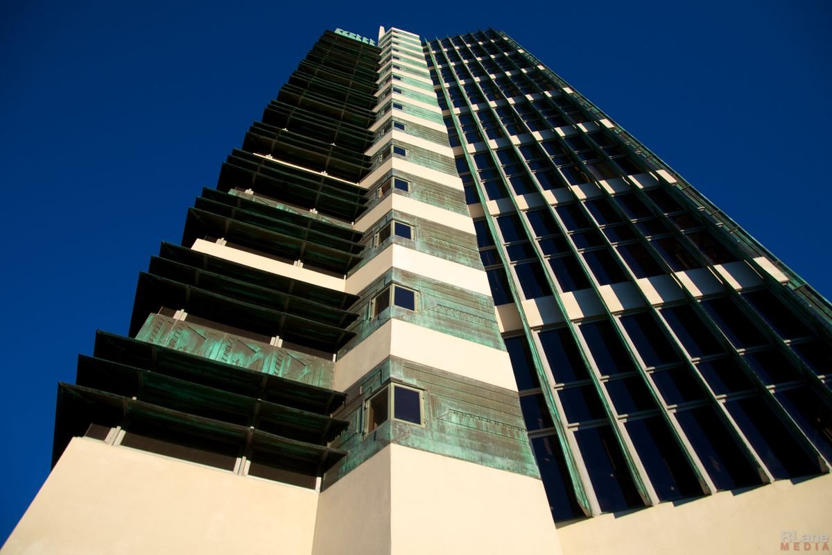
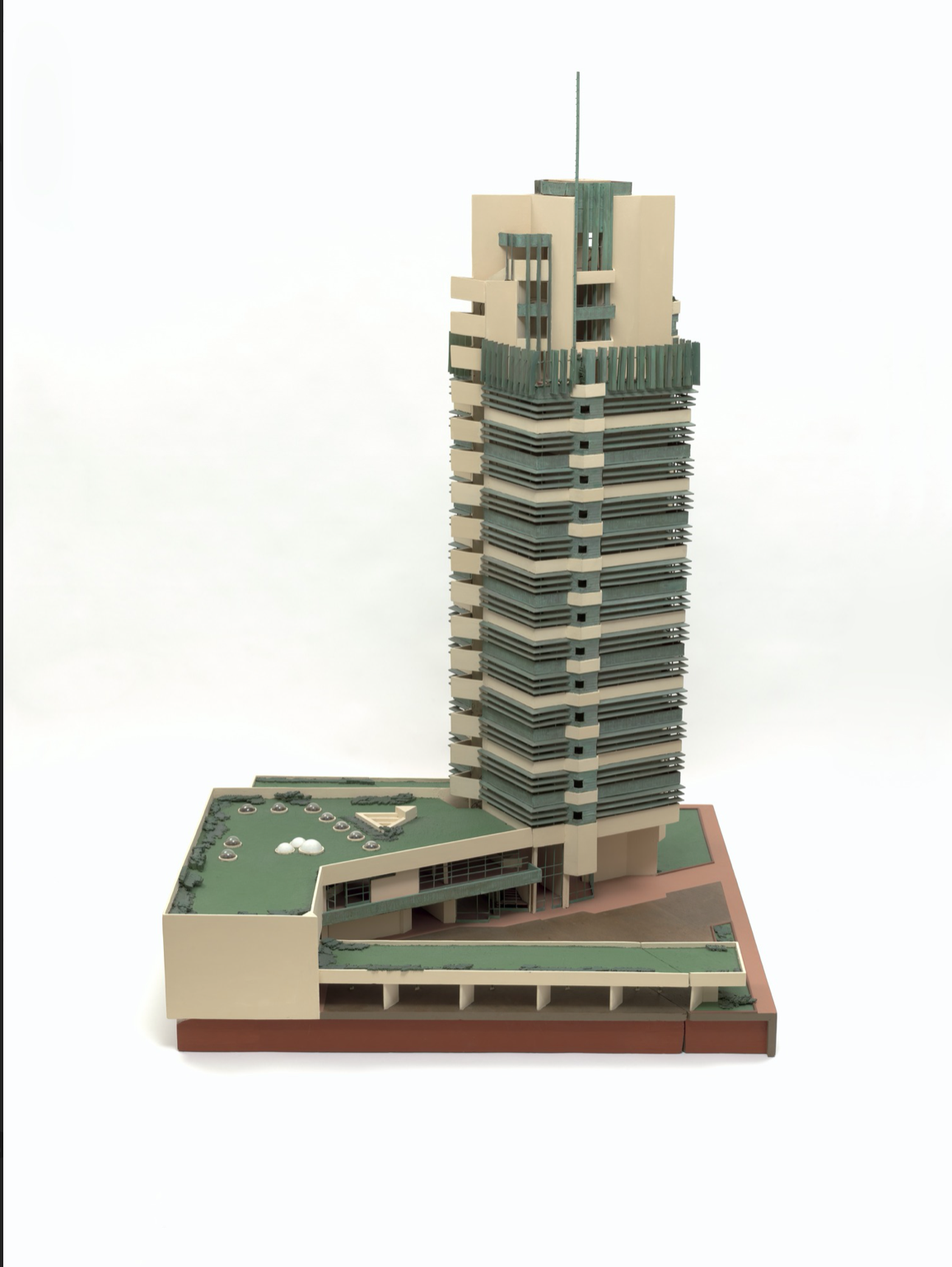
Wright's design for the Price Tower was a departure from his earlier, landscape hugging work. Instead, the Price Tower is a 21-story skyscraper that stands out in its urban context, as well as the norm for design by other tall building architects of the same era. The building's design is notable for its use of geometric shapes and patterns, which are characteristic of Wright's modern-organic style, but prove to be uniquely modern when employed on the vertical landscape.
This exercise of rotating the drafting board was an important example of his ability to adapt his architectural style to the demands of a more urban and modern world. The building's design incorporated many of the principles that Wright had developed throughout his career, such as the use of natural materials, the integration of nature and craft into the built environment, and the creation of a sense of community within the complex. The building's design also reflected Wright's desire to create a more efficient and sustainable urban environment, with its tapering design, interdependent level transition between floors, and all glass exterior allowing for more natural light to penetrate the building.
Completed in 1956, the project was based on an originally designed to St. Mark’s design, the Bowery New York, but once built on the prairies of Oklahoma Wright called this building “the tree that escaped the crowded forest “reference to the origin of the project.
Wright along with building committee devised a way for the project to be a multi-use building with business offices, shops, and even apartments. The Price Company occupied the upper floors, and included a commissary on the sixteenth floor as well as a penthouse office suite for Harold Price, Sr., and later his son, Harold, Jr.
Wright nicknamed the Price Tower, which was built on the Oklahoma prairie, "the tree that escaped the crowded forest," referring not only to the building's construction, but also to the origins of its design.
The building's design also incorporates Wright's concept of the "taproot" which was an engineering metaphor for how Wright saw tall buildings being built — unlike the heavy load bearing walls, or dense steel frames his counterparts were utilizing. The metaphor describes the building as a tree whose trunk is represented by the solid core of building services. The branches, in this case, the concrete floors, cantilever out from the center, which removes the need for columns, and allowing the slabs to decrease its thickness by at least 3 inches at their edges, a tapering technique, which was another of Wrights tower features also utilized at the S.C. Johnson Tower. This technique allows for more natural light to penetrate the building and creates a more delicate, height defying exterior effect.
“In the Price Tower’s design, Wright combined cantilevered with the taproot design. Borrowing from nature, Wright understood that a building’s floors and outer walls could be held aloft in the same way that a tree raises it branches and leaves – with a trunk-anchored in place by a deep, central foundation, or “taproot.”
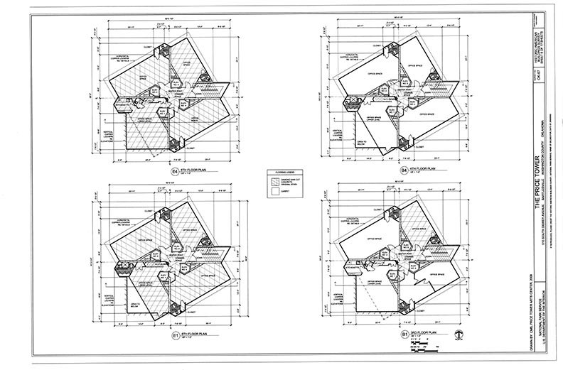
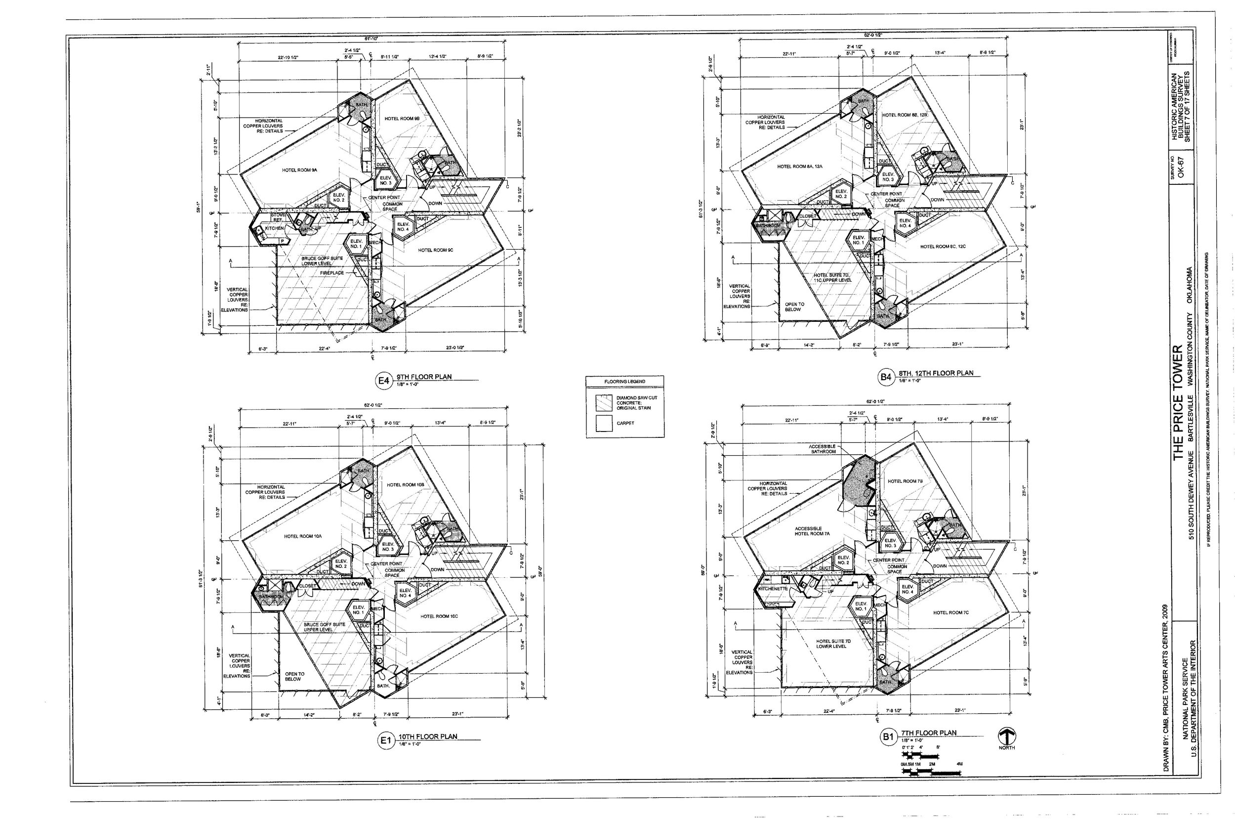
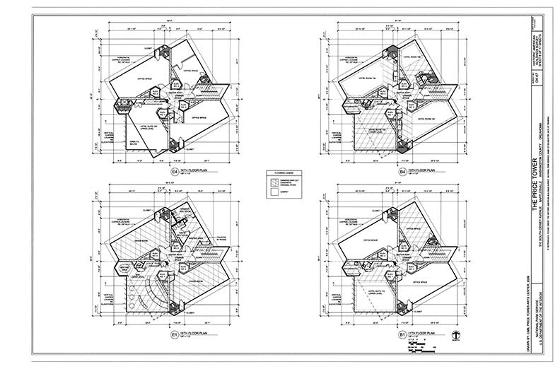
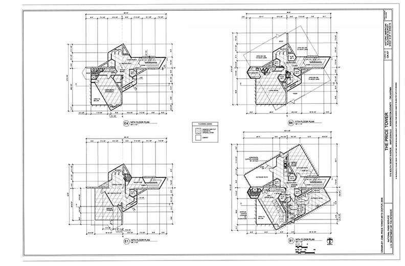
The Price Tower is a 67-meter (220-foot) tall and is divided into 19 floors. The building's design is unique in that it is one of the first multi-use buildings, with each level functioning interdependently with the one above and below, and each floor composed of four quadrants, with the some quadrants utilized as double height apartments, and other three quadrants assigned to as offices, or apartments.
This arrangement of space coupled with the innovative tapering floors truly made use of the vertical landscape in a way previous architects failed to imagine. Instead of the cul-de-sac style dead end floors, Wright working with H.C. Price envisioned something entirely unique at the time.
The materials used by Frank Lloyd Wright in the construction of the Price Tower were innovative for a skyscraper of the 1950s too. The building features concrete interior walls, pigmented concrete floors, aluminum window frames and mullions, and doors with reliefs of patinated copper with textured patterns. The cutting of aluminum windows and the arrangement of coloured artworks creates a visual continuity throughout the design both inside and out. The building's exterior is clad in copper, which was chosen for its durability and natural patina which turns green as it ages. The green copper cladding created a sense of harmony between the building and its natural surroundings blurring where the trees and balconies touch while Oklahoma sandstone further extended the building into its natural surroundings.
The details within the decoration of the Price Tower are also notable. Over Wright’s career he developed a unique geometric pattern style that was distinct from his mentor Louis Sullivan who had coined his own organic style. Drawing inspiration from Aztec and Japanese motifs, Wrights work increasingly explored geometry, pattern making and colour. This style evolved over time as Wright incorporated more geometric shapes and patterns, such as chevrons, diamonds, and zig-zags, into his designs to create a sense of movement and rhythm, and to connect the building with its natural surroundings. Starting in an era of the Arts and Crafts Movement, Wright reinvented himself many times often out-competing the Avant Guard Modernists at their own game.
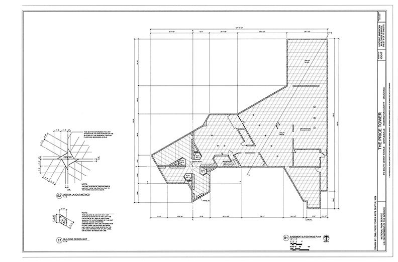
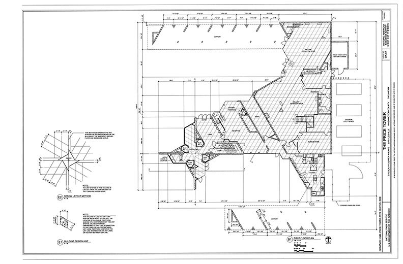
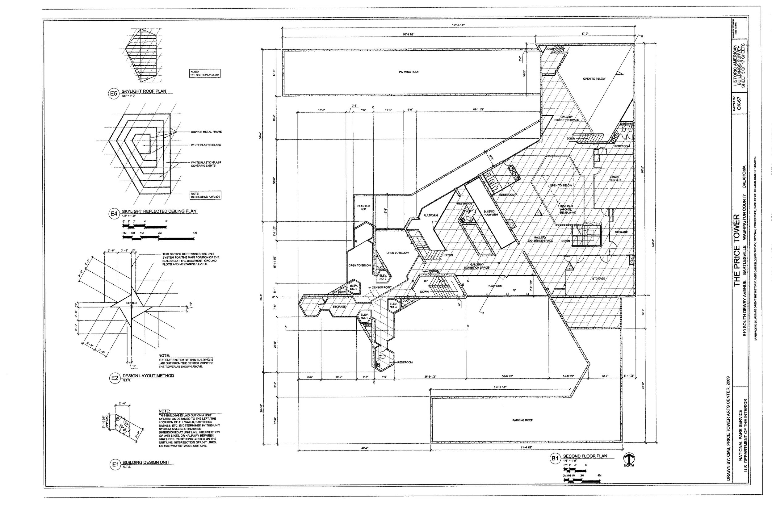
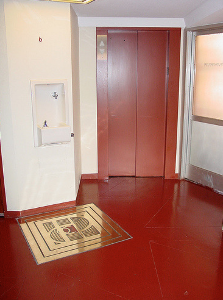
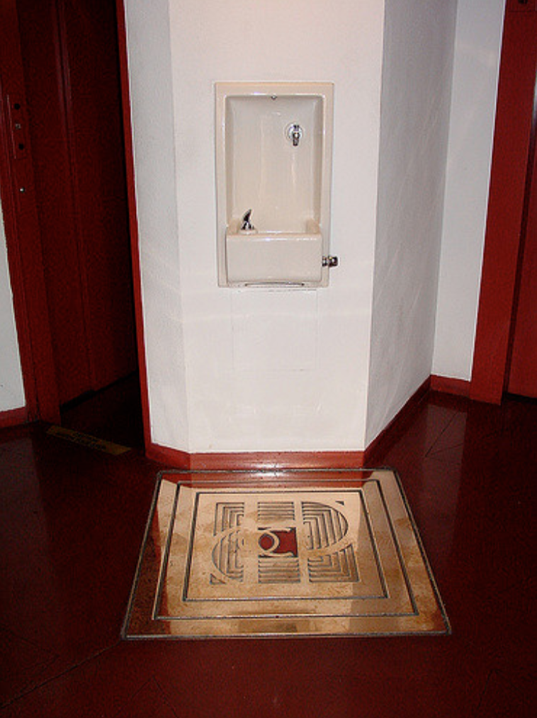
In the Price tower, Wright incorporated his geometric pattern style in the use of the diamond and triangle motifs in the building's exterior and interior design, these shapes can be seen even printed on the floor. The building's structure also is based on this modulus of diamond 30 ° -60 ° and 60 ° -60 °. This geometric pattern style is a reflection of Wright's holistic approach to architecture and his desire to create a cohesive aesthetic throughout the building.
The building's main feature is the Penthouse and Great Workroom, a large, open space located on the top two floors of the building that is illuminated by natural light from a series of skylights. The "Great Workroom" was intended to serve as the main working area for the HC Price Company and its employees.
It is interesting to note that the Price Tower is one of the very few elevators designed by Frank Lloyd Wright, despite his extensive portfolio of architectural work. This is particularly noteworthy considering how much emphasis Wright placed on creating a sense of connection between the building and its natural surroundings, and how elevators could have played an important role in this by providing access to different levels of the building.
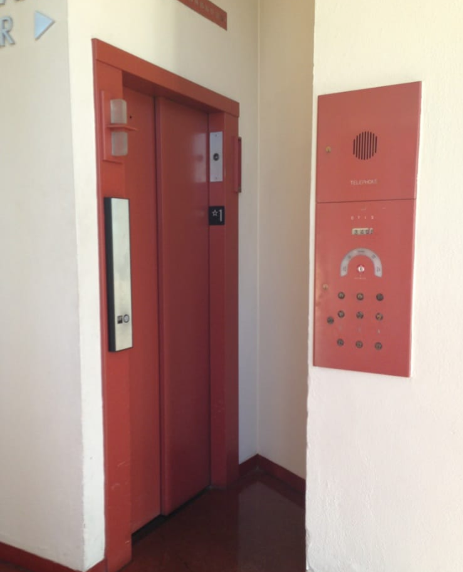
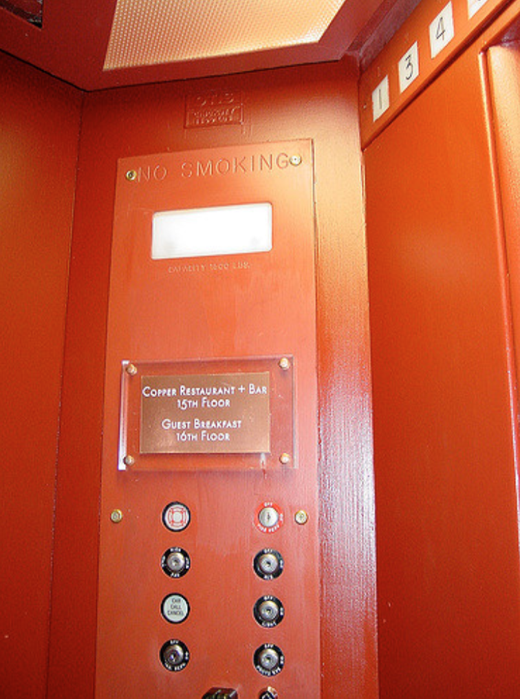
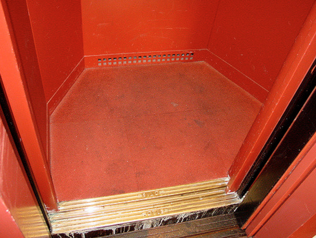
The Price Tower's elevator is a unique one-of-a-kind shape, keeping with the geometry and angles found throughout the building. The elevator was custom designed by Wright himself, and is painted in the iconic burnt ochre red-orange color that he used in many of his interiors. Manufactured by the Otis Elevator Co, known for its high-quality elevator manufacturing and its ability to accommodate Wrights unique version of architecture, we can imagine this Bold red room moving through the tower like a kinetic element more the likes of a Kadinsky painting, or an El Lissitzky Proun.
This unique elevator is a testament to Wright's attention to detail and his desire to create a cohesive aesthetic throughout the building, and provides an interesting insight into how he thought about vertical circulation in his buildings. The elevator's shape and colour seamlessly blends in with the building's design, yet juxtaposing at the same, becoming an integral part of the building's architectural language. It’s easy to imagine Wright wanting to customized every detail, right to the controls and buttons.
Today, the elevator's design seems almost flat, completely void of ornament, it is a reflection of Wright's holistic approach to architecture, where every element, even the elevators, were considered as an opportunity to enhance the overall design and aesthetic of the building without giving into the cliche’s of the era.
The Price Tower is considered a masterpiece of modern architecture and an important addition to the legacy of Frank Lloyd Wright's work. It is an excellent example of how Wright could adapt his organic architectural style to the demands of a more urban and modern world, and how he could design buildings that served a dual purpose, combining functionality
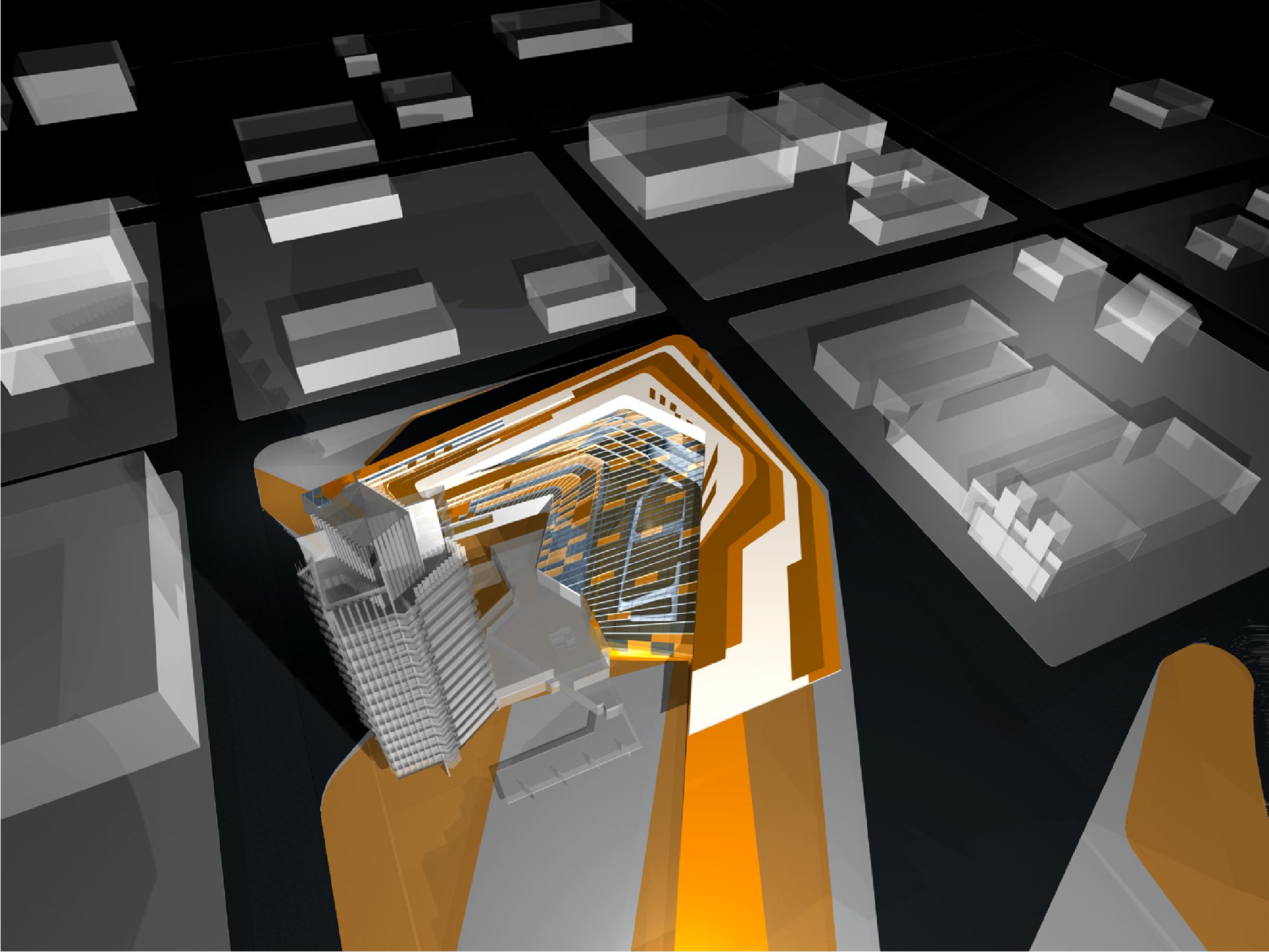
The Price Tower has been of interest to many architects and designers, including Zaha Hadid Studios, who proposed an intervention and partnership with the building. The goal of the partnership was to better integrate the design of the building with its surroundings.
Hadid employed her "urban carpet" methodology, which looked at how a new area and a new building could respond to the existing architecture. To answer this question, Hadid worked on existing street grids to create axes similar to the lines that Wright saw in his plans for the Price Tower. Her design did not compete with the Price Tower, but instead tried different proportions utilizing Wright's own identity.
The result was a fresh, geometric texture that surrounds the Price Tower and connected it to the library and art center, harmonizing the new uses. The adopted patterning and landscaped structure brought visitors indoors along a fluid “urban carpet,” a conceptual extension of the street that draws on the ground plane – and the public activity that takes place on it – into and through the building, leading visitors to a ramp accessing the center's various spaces. The “urban carpet” is thus transformed into a non-urban condition, a “natural” landscape indoors.
Unfortunately, Hadid's proposed expansion has since been archived in the Price Tower Arts Center collections and currently has no plans to be built. Nonetheless, it's an interesting example of how architects and designers can work together to enhance the architecture and urban design of a building and its surroundings.
In the end, Frank Lloyd Wright's design for the Price Tower is a masterpiece of architecture as well as art, both of which has stood the test of time. The building's almost timeless design stands, with its use of geometric patterns, colours, and materials, makes it look both classic and modern at the same time in a way no other architect has achieved when tackling the vertical landscape. The Price Tower is not only a functional building but also a work of art, that has transcended nearly a century and continues to inspire architects and designers today. Wright's ability to create something that is not only functional but also beautiful, timeless and relevant, is a testament to his skill as an architect and artist.


