Foster School of Business boldly brands their elevator!
Your elevator may not be the first space that comes to mind when you dream of the type of investments to make for a new building or upcoming remodel—but it must not be ignored. Often property managers, condo boards and building owners are searching for unique ways to capture and retain tenants.
While there are plenty of areas they can upgrade, the elevator design is one which can have a surprising positive impact for everyone who visits, works or lives in the building. When investing in elevator upgrades, the flooring is often overlooked or simplified using temporary flooring solutions like branded mats or rubber flooring. Below I explore a permanent graphic art installation utilizing typography which has been a game changing hit when it comes to level transition at the Paccar Hall in Seattle.
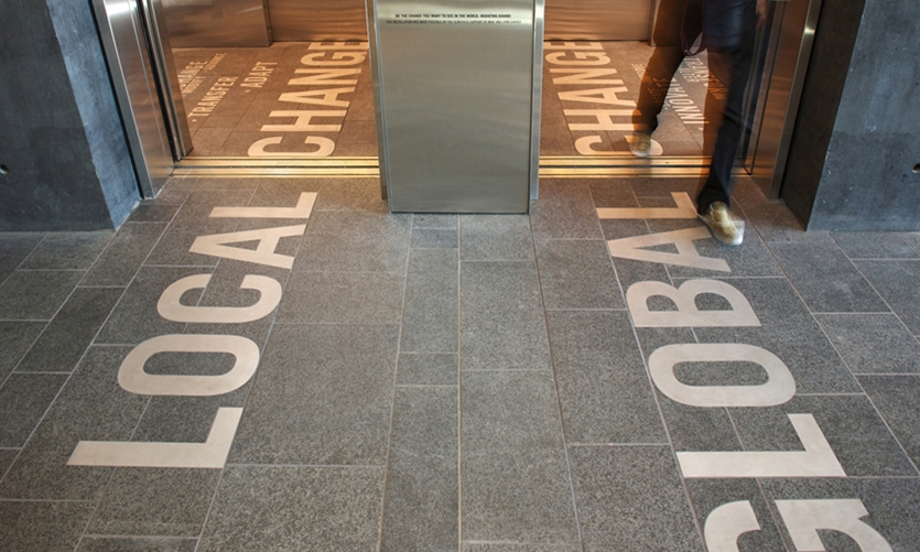
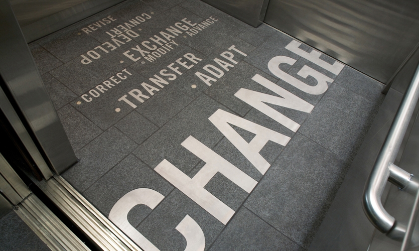
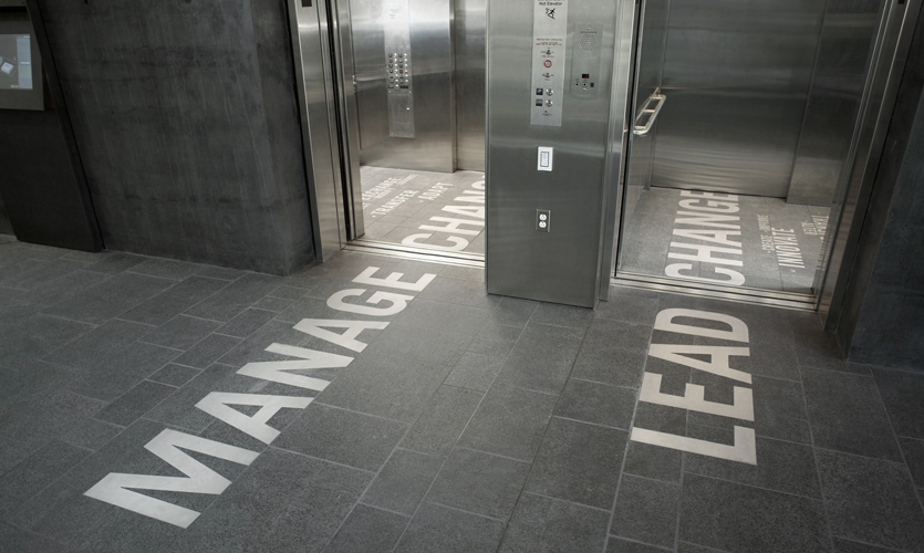
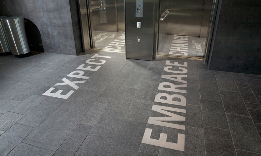
The 'CHANGE' elevator intervention, envisioned by designers Kristine Matthews and Karen Cheng, both on the faculty at the University of Washington resulted in a unique collaboration between art and business—two distinctly contrasting disciplines. The result, a custom elevator installation that allow riders to reflect upon the dynamic relationship between business and change.
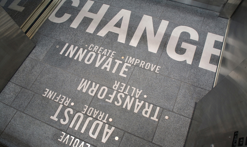
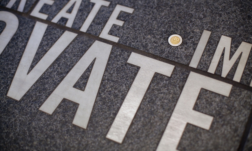
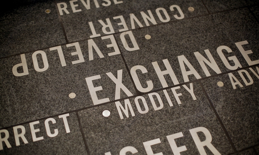
With the CNC cut-out letters and words inlayed literally into the flooring, the word 'CHANGE' appears inside the two elevator floor layouts along with 18 synonyms. Each synonym is highlighted with actual loose change (an international coin). Then on each floor, the word CHANGE is modified by an exterior word inlayed in the elevator lobby area, creating six unique word pairs.
For most designers and architects, the elevator floor isn't at the top list of interesting or captivating finishes however it is one that matters to property owners and managers involved in multi-story buildings. It is important to consider that elevator floors are designed to carry a specific number of passengers / maximum weight load. As an elevator designer and interior consultant I must guarantee that the floor structure design will adequately support the tile assembly and meet ADA guidelines. This means that the finished floor must be flush with the adjacent sill or not exceed the maximum rise allowed within the ADA regulations.
The "CHANGE" concept actually grew out of our desire to incorporate actual "loose change" (coins) into the fabric of the installation. During the design phase, the bankruptcy of General Motors was very much in the news, and several business school faculty members commented on the radical changes facing this iconic American company. We realized that the theme of "CHANGE" allowed us to pair the physical material of coins with a universal business concept -- the need for companies and corporations of all kinds to adapt, transform and embrace change in order to survive.
The days of elevator floors being basic rubber and marmoleum are long gone. Today elevators provide a functional service while affording architects and designers a unique space that not only looks good but contributes to the physical brand and value of a property. This beautiful project shows us how a simple flooring detail can make an everlasting statement.
For more on the project watch the amazing design video shot and edited by Jeremy Juel Music by Sigur Ros showcasing the process behind the graphic branding of the Paccar Hall.


